How-To
This page will walk you through the basics of Citation Network Navigator, the browser tool designed for network metrics and visualization.
Use the slider to select the year whose math citation network you're interested in viewing. Then click "Navigate" to load the network dashboard, with metrics on the left and visualizations on the right.
Read Results

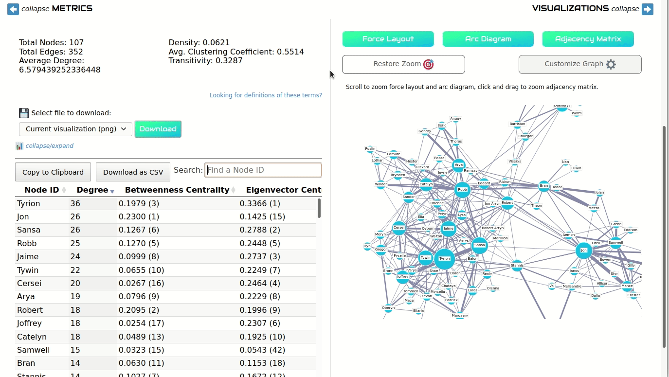
You can collapse either the Metrics or Visualizations sides of the dashboard to get a better view of the data. On the metrics side, you will see a short list of global network metrics, a histogram showing the frequency distribution of different node-level metrics, and a table showing each node and its metric values. (You'll also see download options, which we discuss below.)
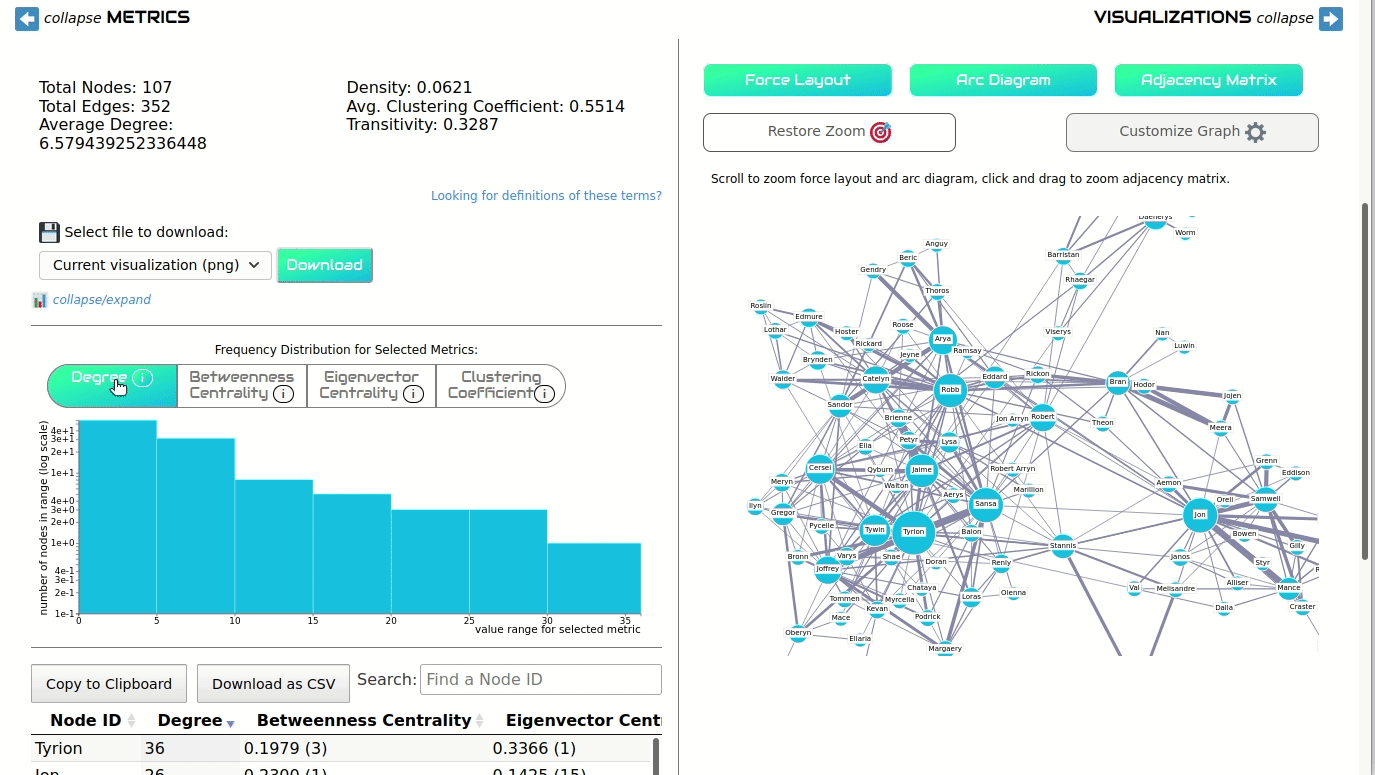
Clicking on the options above the histogram bar chart will show different graphs for each selected metric. These buttons will also update the size of the nodes in the force layout and arc diagram visualizations.

Searching for specific nodes in the data table will also filter the visualization, making it easier to find the node you're looking for.
Read results with care! Some metrics will be affected by the type of graph you select. For example, in many smaller directed graphs, eigenvector centrality will be 0 for every node. Though this looks like an error, it's due to the nature of eigenvector centrality. When possible, Network Navigator displays error messages to explain some of these special cases.
Customize Visualizations
One the right side of the screen, you have three different options for visualizations: clicking on "Force Layout," "Arc Diagram," and "Adjacency Matrix" will display these visualization types.
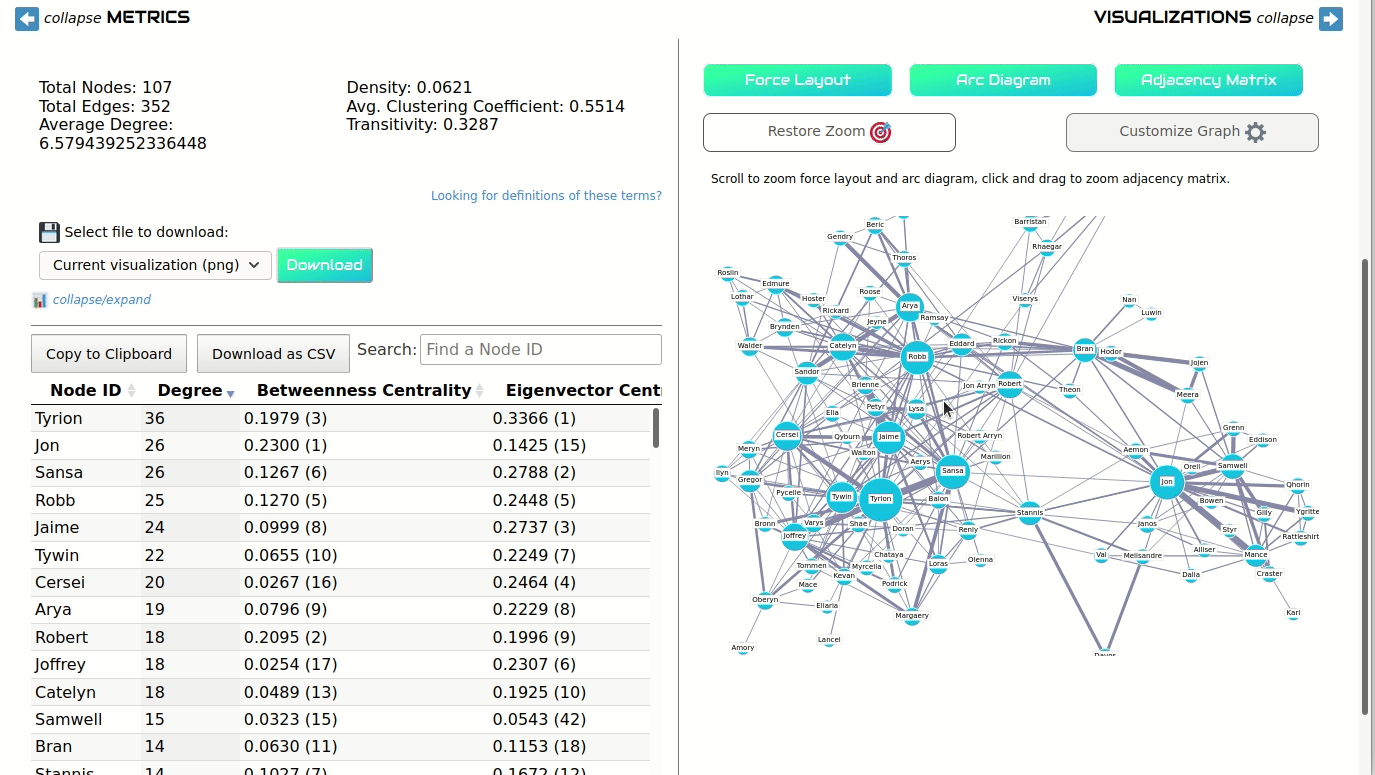
You can scroll to zoom the Force Layout and Arc Diagram. In the Adjacency Matrix, you can click and drag to draw a box around the area you'd like to zoom into. In all visualizations, click the "Restore Zoom" button to return to the original display.

Clicking "Customize Graph" will open a menu, different for each visualization type, that gives options for changing the appearance of the network. You can update the size or color of nodes, hide and show labels, change the order of nodes, and more.
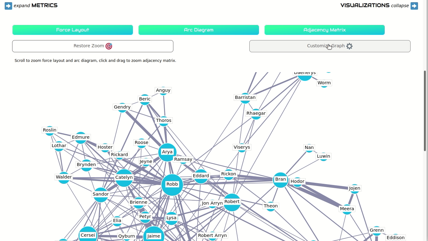
If your data had a header row and included more edge attributes, like edge weights, edge types, or timespans, you can filter the Force Layout and Arc Diagram based on those attributes. Select your desired attribute under "Filter by edge attribute" and navigate through the menus that appear.
Export and Download

On the left side of the screen, beneath the global network metrics, is a set of options for downloading visualizations and data. Choose an option to download: a PNG or SVG of your current visualization view, a PNG of the current histogram, or a TXT file containing the global network metrics.
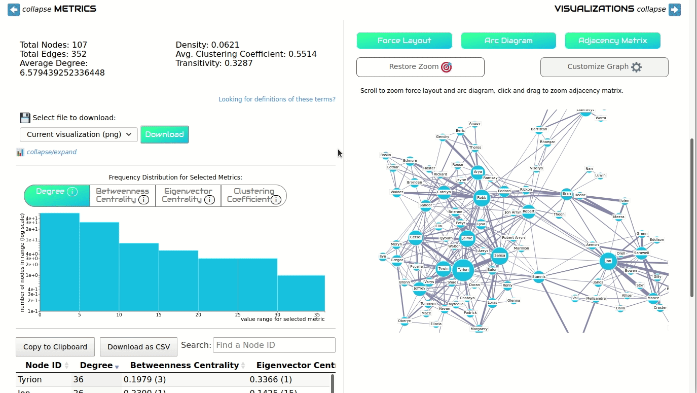
You can also download the full node table as a CSV. To do this, scroll down to the node table and click "Download as CSV." You can also copy the data to the clipboard.
Last Updated: April 2022